
The Santa Monica Revolution was a cycling group that wanted to capture the lively atmosphere of Downtown Santa Monica. The Obvious motifs to draw from were the tall palm trees, as well as the Santa Monica Pier. I was given creative freedom when it came to designing two jerseys for the group. I wanted to create two unique jerseys that could be used interchangeably but also feel as if they are both part of the same set. What was accomplished was something I believe worked quite well.

The image below shows the three main logos used between both jersey sets. The logo that contains the Ferris wheel is the main logo. While the Santa Monica, and the Revolutio are the the two wordmark logos that accent the jerseys.

The image below shows the two main fonts used for both jerseys.

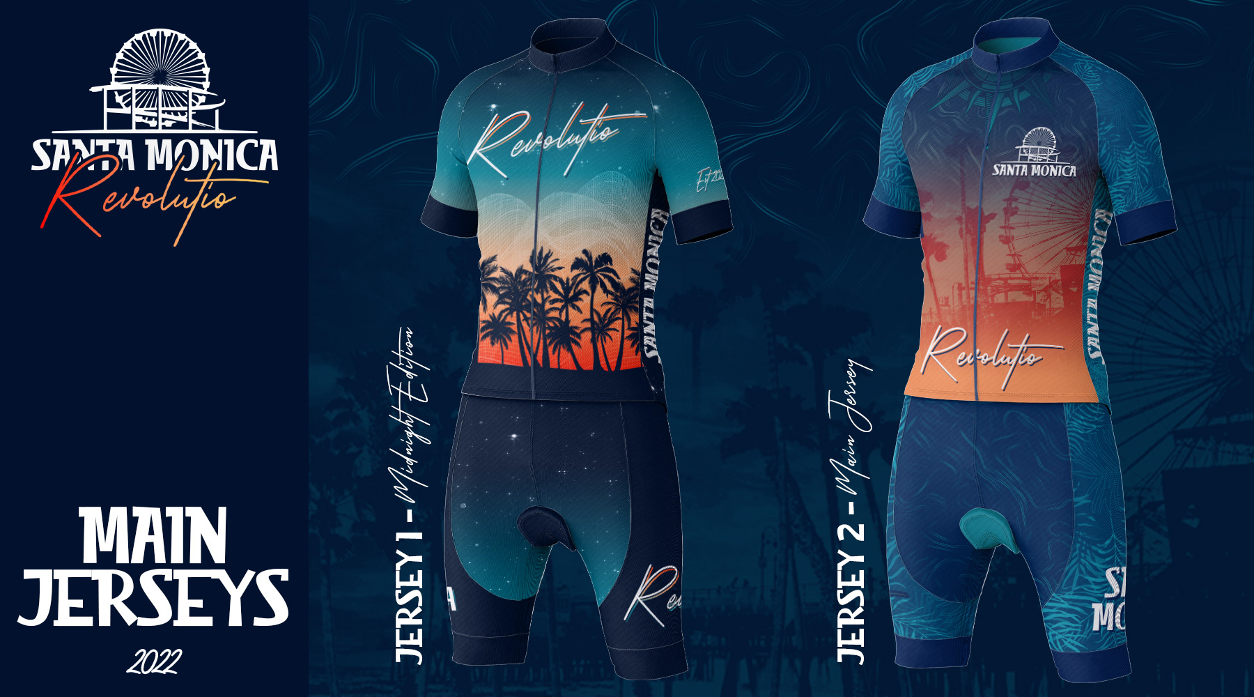
The image below showcases both jerseys side by side to show the theme shared between the two. The theme being that of Santa Monica night life as the sun goes down.
Below is the teaser image for jersey one.

Jersey one is called the midnight jersey since it showcases the early night time sunset. From the silhouetted palm trees, to the stars light starting to show towards the top of the jersey.

Below is the teaser image for jersey two.

Jersey two is called the main jersey since it showcases the main jersey for the group. This jersey showcases the Santa Monica Pier as its main backdrop image. The images of palm frond leaves, and a compass rose were added to give a nautical theme to this jersey, as Santa Monica sits on the shore. Wavy textures towards the top of the jersey also evoke the feelings of movement and water to further enhance the nautical theme.

